![]()
Controls allow users to interact with PowerBuilder objects, such as windows and DataWindows. You set properties of these controls and later add script for control events and functions.
Selecting a control button from the PainterBar You can add controls from the Insert menu or by selecting a control button in PainterBar1. Unless you customize your toolbars, there is only one control button that appears in the PainterBar. When you first open a painter, PainterBar1 includes the CommandButton control button, which has a down arrow to its right. Clicking the down arrow displays a drop-down list of control buttons.
Some of the controls you can select from the drop-down list are described in the table below:
Button appearance |
Control type |
Use in tutorial |
|---|---|---|
 |
CommandButton |
Default icon for the control button in PainterBar1. You add command buttons later in this lesson. |
 |
Picture |
To add a picture to the login window. |
 |
PictureHyperlink |
Not used in tutorial. Its purpose is to provide a link to a Web site. |
 |
PictureButton |
Not used in tutorial. It is like a command button, but it displays a picture as well as text. |
 |
StaticText |
To add text labels to the login window. |
 |
StaticHyperLink |
To provide a link to a Web site. |
 |
SingleLineEdit |
To add user entry text boxes to the login window. |
 |
MultiLineEdit |
Not used in tutorial. Its purpose is to add a multiline edit text box. |
After you select a control, it appears in place of the CommandButton button on PainterBar1.
![]() Adding controls with a 3D appearance
To make
your controls look three dimensional, select Design>Options from
the menu bar and make sure that the Default To 3D check box is selected
on the General page of the Options dialog box. You can change the
window background color from the default color of ButtonFace gray
using the Properties view in the Window painter.
Adding controls with a 3D appearance
To make
your controls look three dimensional, select Design>Options from
the menu bar and make sure that the Default To 3D check box is selected
on the General page of the Options dialog box. You can change the
window background color from the default color of ButtonFace gray
using the Properties view in the Window painter.
Now you modify the login window you just created by adding controls and changing some of their properties. You:
Now you add a Picture control to the login window.
Select the Picture button from the drop-down list of controls
or
Select Insert>Control>Picture from the menu bar.

Click inside the rectangular window in the Layout view.
A Picture control displays at the selected location. At the same time you add the control, the Properties view switches from displaying the window properties to displaying the control properties.
If you do not see the Properties view, select View>Properties from the menu bar. If the Properties view does not display the control properties, click the picture control in the Layout view.
Select the text p_1 in the Name text box on the General tab of the Properties view.
Type p_sports in
the Name text box.
This names the Picture control. The prefix p_ is standard for Picture controls.
Click the ellipsis button next to the PictureName text box.
The Select Picture dialog box displays.
Navigate to the Tutorial directory if it is not already selected.
Select the tutsport.bmp file.
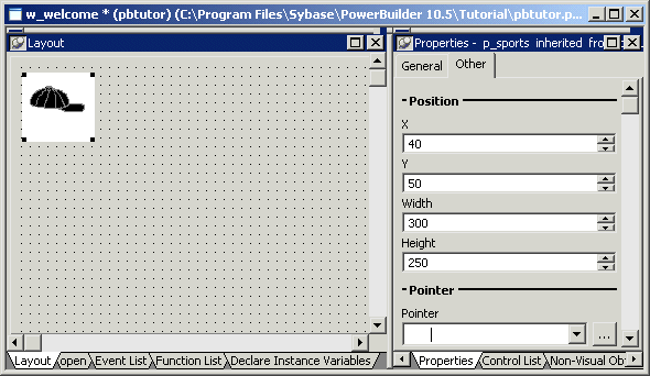
The bitmap you selected appears in the control you added to the Layout view. The Visible, Enabled, and OriginalSize check boxes are selected by default in the Properties view.
Make sure the picture control is selected in the Layout view.
Click the Other tab in the Properties view.
Type 40 in the
X text box and 50 in the Y
text box.
You can use the spin controls in the X and Y text boxes to enter these values. You might want to adjust the position of the picture control again after you preview the window at the end of this lesson.
Type 300 in
the Width text box and 250 in
the Height text box.
You change the size of the picture control. You might want to adjust the picture size again after you preview the window.

Now you add StaticText controls to the login window. You will use these controls to add descriptive labels to the login window.
Select the Text button from the drop-down list of controls
or
Select Insert>Control>StaticText from the menu bar.

Click to the right of the Picture control you added in the Layout view.
A StaticText control displays at the selected location.
Right-click the StaticText control and select Duplicate from the pop-up menu.
PowerBuilder creates a duplicate of the selected control.
Select Duplicate from the StaticText control’s pop-up menu again.
PowerBuilder creates another duplicate.
You now have three StaticText controls arranged vertically at the top of the window.
Adjust the location of the Static Text controls so that there are at least two grid lines between them.
Now you specify the properties of the StaticText controls (label text boxes) to define how they should appear on the login window.
Select the first StaticText control you added by clicking on it.
The Properties view displays properties of the StaticText control. If you do not see the Properties view, select View>Properties from the menu bar.
Select the text st_1 in the Name text box on the General page of the Properties view.
Type st_welcome in
the Name text box.
Now the control has a more descriptive name. The prefix st_ is standard for StaticText controls.
Select the text none in the Text text box.
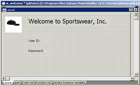
Type Welcome to SportsWear, Inc.
If you press Enter, click to another field or tab to another page in the Properties view, or click in a different view, the text you typed replaces none in the Layout view.
Click the Font tab in the Properties view.
Change the TextSize property for this control to 18 points.
The size of the text in the control changes.
The default typeface is Arial TrueType. You can select a different typeface and font size if this one is not available on your system.
Adjust the size of the StaticText control to fit the text you entered.
Keep adjusting the size until you see all of the text you entered.
To adjust the size, drag the upper-right corner of the control toward the upper-right corner of the window in the Layout view.
You can also adjust the size by entering appropriate values on the Other page of the Properties view for this control.
Select the second StaticText control you added in the Layout view.
Type st_userid in
the Name text box on the Properties view General page.
Type User ID: in
the Text text box and press the Tab key.
The text displayed in the control changes.
Select the third StaticText control you added in the Layout view.
Type st_password in
the Name text box on the Properties view General page.
Type Password: in
the Text text box and press the Tab key.
Your changes display in the Layout view.

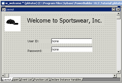
Now you add two SingleLineEdit controls to the window to allow the user to enter a user ID and password for connecting to the database. A SingleLineEdit control is a text box in which the user can enter a single line of text. SingleLineEdit controls are typically used for the input and output of data.
Select the SingleLineEdit button from the drop-down list of controls
or
Select Insert>Control>SingleLineEdit from the menu bar.

Click to the right of the st_userid StaticText control in the Layout view.
A SingleLineEdit control displays where you clicked.
Increase the width of the SingleLineEdit control.
Right-click the SingleLineEdit control and select Duplicate from the pop-up menu.
Adjust the position of this SingleLineEdit control so that it is just to the right of the st_password StaticText control.
You should now have two SingleLineEdit controls arranged vertically to the right of the StaticText controls.

Now you define the properties of the SingleLineEdit controls you just added to the login window.
Select the first SingleLineEdit control you added.
The General page of the Properties view displays properties of the SingleLineEdit control. If you do not see the Properties view, select View>Properties from the menu bar.
Select the text sle_1 in the Name text box.
Type sle_userid in
the Name text box.
Clear the default text none in the Text text box.
The prefix sle_ is standard for SingleLineEdit controls.
Select the second SingleLineEdit control you added.
Type sle_password in
the Name text box.
Clear the default text none in the Text text box.
Select the Password check
box.
Because you checked the Password check box, the password the user types at runtime will display as a string of asterisks.
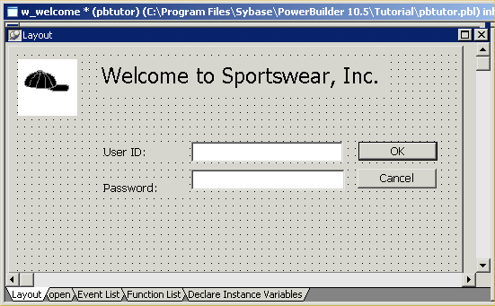
Now you add CommandButton controls. Later you define scripts that execute when users click these buttons.
Select the CommandButton button from the drop-down list of controls
or
Select Insert>Control>CommandButton from the menu bar.

Click to the right of the sle_userid SingleLineEdit control.
A CommandButton control displays where you clicked.
Right-click the CommandButton control and select Duplicate from the pop-up menu.
PowerBuilder creates a duplicate of the selected control.
Adjust the location of the controls as needed so that there is some space between them.
Now you define the properties of the CommandButton controls.
Select the top CommandButton control.
The General page of the Properties view displays properties of the CommandButton control.
Type cb_ok in
the Name text box on the Properties view General page.
Type OK in the
Text text box.
Select the Default check box.
This step changes the default name of the control to something more descriptive and adds a text label (OK) to the button. Because you selected the Default check box, when an application user presses the Enter key, the Clicked event for this button will be triggered. (The user does not have to click the button itself for the event to be triggered.)
Select the bottom CommandButton control.
Type cb_cancel in
the Name text box.
Type Cancel in
the Text text box.
Select the Cancel check box.
Because you selected the Cancel check box, when an application user presses the Esc key, the Clicked event for this button will be triggered.
