![]()
![]()
![]()
![]()
![]()
To enhance the graph, you:
Resize and reposition it
Add a title
Change graph types
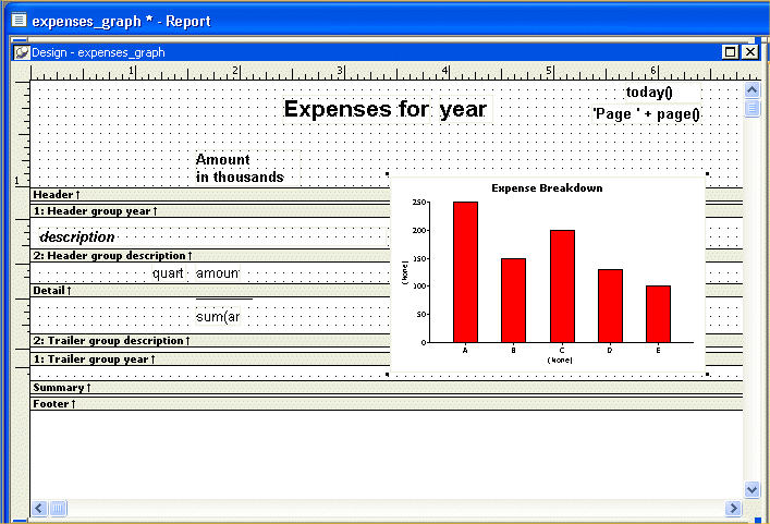
Usually you work in the Design view when enhancing a report or graph, but to resize and reposition a graph, you may find it easier to work on it in the Preview view. You can get a much better idea of what the page looks like. The sizing and positioning changes you make are retained and reflected in the Design view.
Resize and reposition the graph so that it looks like the one shown here.
To make the graph bigger, put the pointer near a corner or a side until the pointer changes shape. Then click and drag the corner or the side. To move the graph, put the pointer in the middle of the graph and then click and drag the graph.
Use the scroll bar to display the graphs for 2004 and 2005.
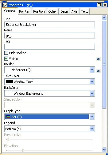
Move the pointer to the middle of the graph in the Design view (not the Preview view) and click.
This selects the graph. The current title, (None), displays on the graph, in the text box in the StyleBar, and in the Properties view.
Type Expense Breakdown.
The title displays in the graph and in the text box.
You can use many different types of graphs to present the same data. Sometimes it is useful to try different types until you find the one that works best for the data you are presenting.
Now you try several graph types with the expense data.
If you need to, use the scroll bar to display the entire graph in the Design view.
Move the pointer to the graph in Design view and click it.
The graph is selected. The properties for the graph display in the Properties view, with the General page on top. On this page you can choose a graph type. The current graph type is Column (Col (7)).
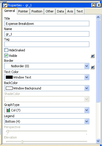
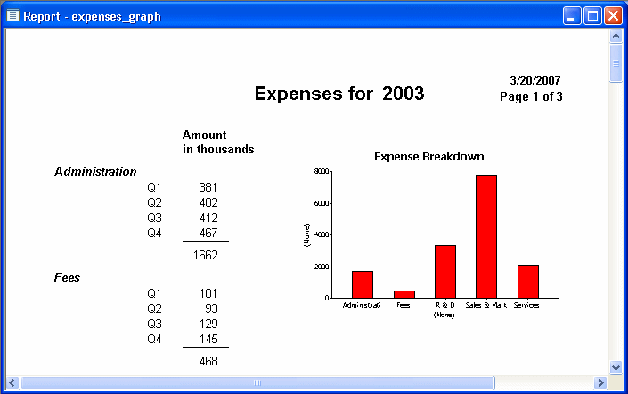
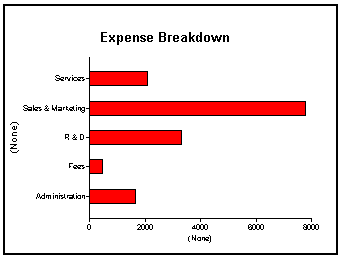
Select the Bar (2) graph type from the Graph Type drop-down list.
The graph looks like this in the Preview view.
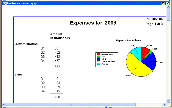
Select the Pie (13) graph type from the Graph Type drop-down list.
InfoMaker redisplays the graph using the Pie style.
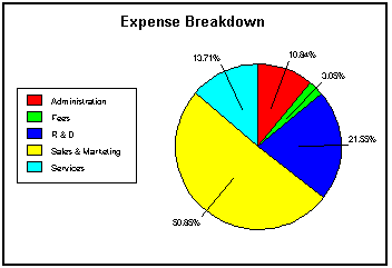
Pie seems to be a good style for showing the data, so you do not change the graph style again.
This is what the report with the graph looks like now.