![]()
![]()
![]()
![]()
![]()
The report you are working with has three pages, one for each of three years. The graph you create will be on all three pages. Its format will look the same from page to page, but the data will be for the correct year for each page.
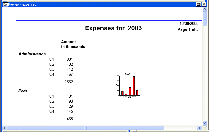
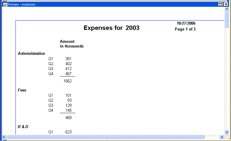
This is what a graph for 2003 looks like. It shows the year’s expenses in five categories.
Select Insert>Control>Graph from the menu bar.
Click in the middle of the Design view.
The Graph Data dialog box displays.
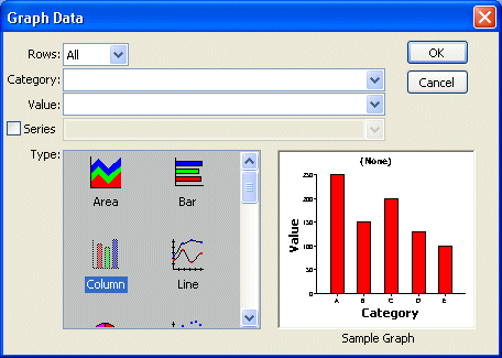
Click the down arrow on the Rows box.
The drop-down list shows choices for rows.
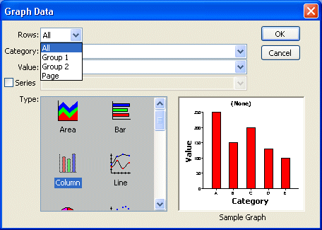
The All option includes all rows in the graph. Since you want to have the appropriate graph for each of three years, you do not want to include all rows in the graph at the same time.
The Group 1 option includes the rows for the current Group 1. Group 1 for this report is grouping by year, so Group 1 is what you want. When you specify Group 1, you ensure that the graph includes only rows from the current year.
Select Group 1.
Next you fill in the Category and Value boxes. The graph will show expenses for the year by type of expense. (For this graph you do not need to fill in the Series box.)
The description column provides the categories (Administration, Fees, R&D, Sales & Marketing, Services).
The sum of the amounts for the four quarters for each category provides the values.
Click the down arrow next to the Category box.
A drop-down list displays the columns you can choose to supply the categories to use in the graph. (You can think of categories as X values.)
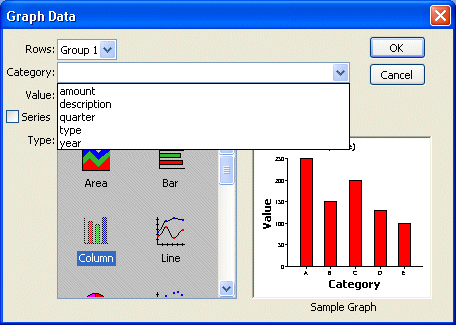
Select description.
This specifies that the values in the description column are the categories.
Click the down arrow next to the Value box.
A drop-down list displays all the choices for the column to supply the values to use in the graph. Notice that the choices include expressions such as counts and sums.
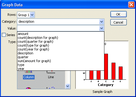
Select sum(amount for graph).
This specifies that the sum of the amount column is the value. A separate value is calculated for each category within each year.
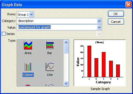
Click OK.
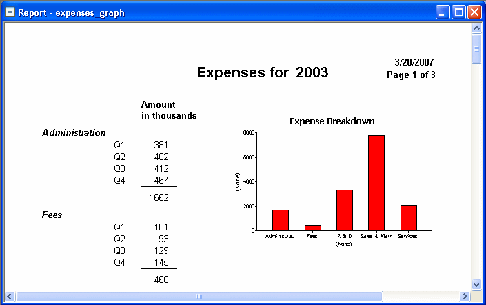
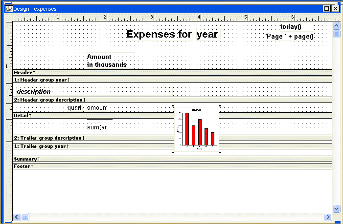
The graph displays in the report. What you see in the Design view is a representation of the graph. To see what it looks like in the report, you need to look at it in the Preview view.
Look at the graph in the Preview view.
In the Preview view, InfoMaker displays the data retrieved from the database both in the report and in the graph. The graph is small right now. In a few minutes, you will resize it.