![]()
![]()
Scatter graphs show data points with their x and y coordinates. Typically you use scatter graphs to show the relationship between two sets of numeric values. Non-numeric values, such as string and DateTime datatypes, do not display correctly.
Scatter graphs do not use categories. Instead, numeric values are plotted along both axes—as opposed to other graphs, which have values along one axis and categories along the other axis.
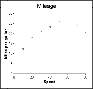
For example, the data in Table 24-3 shows the effect of speed on the mileage of a sedan.
Speed |
Mileage |
|---|---|
10 |
12 |
20 |
18 |
30 |
21 |
40 |
23 |
50 |
26 |
60 |
26 |
70 |
24 |
80 |
20 |
The same data is displayed in a scatter graph in Figure 24-4.
Figure 24-4: Scatter graph example
You can have multiple series of data in a scatter graph. You might want to plot mileage versus speed for several makes of cars in the same graph.
| Copyright © 2004. Sybase Inc. All rights reserved. |
|
|
