![]()
![]()
EP 6.1 lets you create a dial gauges, which allow you to create graphic comparisons, patterns, and trends of data. Figure 1-1 shows an example dial gauge.
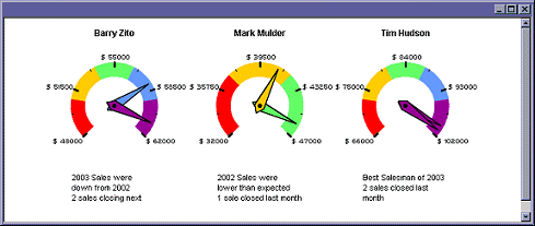
Instead of analyzing several columns of worksheet data, you can see at a glance what the sales figures are for each salesperson.The following procedure uses the sample EP data to create a dial gauge.
![]() Creating dial gauges
Creating dial gauges
This tutorial requires the Flash Player version 7 or later.
Log in to Web Studio.
Select Build Portlets from the left pane, then click New to open the Portlet Builder.
Click Add to perform a new Web capture.
In the New Web Element window, enter this URL in the Location field, then click Find:
http://<HOST>:<PORT>/onepage/portlets/flash/dialgauge/SampleData.jsp
where <HOST> is the name of the machine on which EP is installed, including the domain (for example, “tahiti.sybase.com”), and <PORT> is the number of the port on which EP is running.
Verify that the selected Format is One Click and click Next.
Perform a one-click capture on the table; when the window displays where you select which captured image to use, click Select by the image with the gray background and the thin white border lines between the table cells. Click Next.
When the Split window displays, click Next.
When the Define window displays, select the Records Contain Labels option, and click Next.
At the Filter window, click Next.
In the window where you enter the Element Name, enter dial
gauge, and click Next.
In the Continuous Capture window, click Finish. You return to the Portlet Builder.
In the Portlet Builder, click the Labels button.
In the Portlet Labels dialog box, enter the word “Header” in the Label field, then click the plus sign to create a label for that entry.
After you click the plus sign, a new Label field displays. Create a new label for each of the following:
Header
Value1
Start
End
Value2
Limit1
Limit2
Limit3
Limit4
Limit5
Text1
Text2
The labels you create indicate which column:
Header – contains the titles for the Flash dial gauges.
Value – contains the current value for the Flash dial gauge pointers. Because there can be multiple pointers, each Value label must end with a number to differentiate the labels from each other.
Start – contains the smallest value on the Flash dial gauge.
End – contains the largest value on the Flash dial gauge.
Limit – contains the highest value of the color ranges on the Flash dial gauge. Because there can be multiple color ranges, each Limit label must end with a number to differentiate the labels from each other.
Text – contains text that displays in a scrollable text box below the Flash dial gauge. Because there can be multiple pieces of text data, each Text label must end with a number to differentiate the labels from each other.
![]() The Event Value label is not covered in this example.
See “Flash dial gauge template customization” for
more information on the Event Value label.
The Event Value label is not covered in this example.
See “Flash dial gauge template customization” for
more information on the Event Value label.
Click OK when you finish.
In the Portlet Builder, click the element name (“dial gauge”) to expand the list of column names. To the right of each column name is a drop-down list with the label names you created earlier.
Selecting from the drop-down lists, create the following associations. Do not be concerned if the portlet preview in the right pane disappears.
Sales Rep – Header
Current Sales – Value1
Lowest Sales – Start
Highest Sales – End
Projected – Value2
Cutoff1 – Limit1
Cutoff2 – Limit2
Cutoff3 – Limit3
Cutoff4 – Limit4
Cutoff5 – Limit5
Info1 – Text1
Info2 – Text2
Set the top drop-down list in the left pane to “Content.” The preview reappears. The top drop-down must be set to “Content” to create the Flash dial gauge.
Verify that the selected Device Type is “portal.”
Click the down arrow to the right of the Template button, and select Dashboard from the drop-down list. A wizard appears that lets you create a Flash dial gauge dashboard template. The template you create replaces the table with the Flash dial gauge movie file.
In the menu that displays, select Dashboard. You see the Flash Dial Gauge Template Customization window.
On the General tab, enter:
Template Name – FlashDialGauge1.
Make sure there are no spaces in your entry.
Update Frequency – 0 (zero).
Roles – click Add All to add all available roles to the assigned role list.
On the Appearance tab, enter 270 for
the Angular Width.
On the Colors tab, enter #990099 and
click Add to add the color to the list of default colors.
Do not make any changes on the Header & Text tab.
On the Labels tab, accept the default values for all options with these two exceptions. Enter:
Number of Decimals – 2
Label Prefix – $_ (a
dollar sign followed by a single space)
Do not make any changes to the Tooltip, Tick Marks, or Event tabs.
On the Preview tab, view the template customization changes you entered.
![]() Labels that contain decimal divisions contain two decimal
places, and all labels have a dollar sign and a space prefix.
Labels that contain decimal divisions contain two decimal
places, and all labels have a dollar sign and a space prefix.
Click Finish to save the template automatically and apply it to the portlet.
When you see the message that the dashboard widget has been saved, click OK.
![]() You return to the Portlet Builder. If you see “Missing
XML data” or a blank preview in the right pane, do not
be concerned—this is not an error. Not all flash movie
portlets can be previewed in the Portlet Builder.
You return to the Portlet Builder. If you see “Missing
XML data” or a blank preview in the right pane, do not
be concerned—this is not an error. Not all flash movie
portlets can be previewed in the Portlet Builder.
In the Portlet Builder, click Save.
In the Finish window, enter Sales
Gauges for the portlet name.
On the Roles tab, click Add All to add all roles to the Assigned Roles list.
Click Finish. When you see the message that the portlet was successfully saved, click OK.
In the Portlet Builder, click Close to close the window.
When you return to the Portlet Manager, you see the portlet you created in the list of new portlets.
Select the Sales Gauge portlet in the detail list and click Preview. You can also right-click the portlet name and select Preview from the menu.
The dial gauge movie renders animated dials of the sample data.
To edit a dial gauge template, edit the portlet and run the dial gauge wizard again.
| Copyright © 2004. Sybase Inc. All rights reserved. |
|
|
