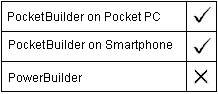
The Toolbar control is typically used as a visual extension to a Pocket PC application menu.
Toolbar property |
Datatype |
Description |
|---|---|---|
Boolean |
Specifies whether the control is enabled. Values are:
|
|
Integer |
Specifies the height of the control, in PowerBuilder units. |
|
String array |
Specifies the initial item strings in the ToolbarItem portion of the Toolbar control. After initialization, this array can be updated only through function calls, such as AddItem or DeleteItem. |
|
ItemCount |
Integer |
Specifies the number of toolbar items in the Toolbar control. After initialization, this property can be updated only through function calls, such as AddItem or DeleteItem. |
Integer |
Specifies the height of the picture, in pixels. This property can be set only when there are no images in the image list. If the value is 0 at the time the first image is added, the size of that image is used to set the size of the rest of the images added. |
|
String array |
Specifies the picture name for each item in the Item property array. After initialization, this array can be updated only through the AddPicture function call. |
|
Integer |
Specifies the width of the picture, in pixels. This property can only be set when there are no images in the image list. If the value is 0 at the time the first image is added, the size of that image is used to set the size of the rest of the images added. |
|
ToolbarAlignment (enumeration) |
Specifies whether the toolbar is docked at the top or the bottom. Values are:
|
|
Boolean |
Specifies whether the control is visible. Values are:
|
|
Integer |
Read-only property that specifies the width of the control, in PowerBuilder units. |
|
Boolean |
Specifies whether toolbar items wrap onto a second line. Values are:
|
|
Integer |
Read-only property that specifies the X position (the distance from the left edge of the parent window), in PowerBuilder units. |
|
Integer |
Read-only property that specifies the Y position (the distance from the top of the parent window), in PowerBuilder units. |
Toolbar event |
Occurs |
|---|---|
Immediately after a toolbar item is tapped or clicked |
Toolbar function |
Datatype returned |
Description |
|---|---|---|
Integer |
Adds a toolbar item to the toolbar |
|
Integer |
Adds a picture to the toolbar picture array |
|
Integer |
Removes a toolbar item from the toolbar |
|
Destroy |
Integer |
Removes the toolbar |
Integer |
Returns a toolbar item |
|
Integer |
Returns the picture index that corresponds to the item index for the toolbar item |
|
Integer |
Returns the state of a toolbar item |
|
Long |
Inserts a toolbar item in the toolbar |
|
Integer |
Specifies the picture to be used for a toolbar item |
|
Boolean |
Sets the state of a toolbar item |
| Copyright © 2004. Sybase Inc. All rights reserved. |
|
|
