The presentation style you select for a DataWindow object determines the format PowerBuilder uses to display the DataWindow object in the Design view. PowerBuilder 10.5 includes a new DataWindow wizard that lets you create a DataWindow using a TreeView presentation style. With the TreeView presentation style, you can group hierarchical data and display the data in collapsed or expanded format. The TreeView DataWindow style cannot be used with the Web DataWindow.
You use the TreeView DataWindow wizard to create a TreeView DataWindow object with one TreeView level. You add additional levels to the TreeView by selecting Rows>Create TreeView Level from the menu bar.
This sample TreeView DataWindow uses the department and employee tables in the EAS Demo database and has two TreeView levels. The first level is the department name. The second level is the city where each employee resides:
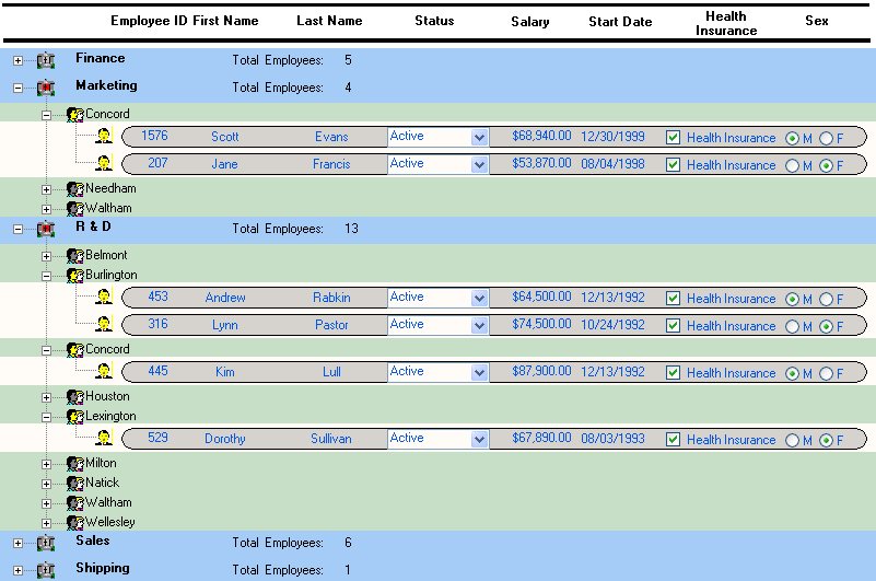
When you use a TreeView DataWindow, you click the state icon to expand or collapse a node. The state icon is a plus (+) sign when the node is collapsed and a minus (-) sign when it is expanded. When a node is expanded, connecting lines display by default to show more detail and indicate how the parent data connects with child data. When a node is collapsed, only the parent data displays; the detail data does not display.
You can set TreeView DataWindow properties to customize the TreeView style, use methods to expand and collapse TreeView nodes, and use events that are fired when a node is expanded or collapsed. For reference information about properties, events and methods, see the following topics in the DataWindow Reference or the online Help:
Properties
Events
Methods
For more information, see “TreeView presentation style” in the User’s Guide.
