Examples

To graph sales in each quarter and overlay the sales of each individual printer, specify the graph's data as in “Graphing unit sales of each printer”, but use the following expression in the Series box:

"Total Sales", "@overlay~t + product"

Figure 24-18 shows the resulting graph.

Figure 24-18: Graph with overlay for individual product sales by quarter
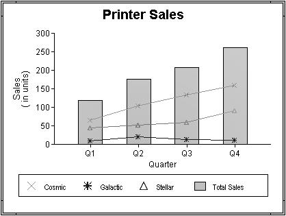
Shown is the Printer Sales graph with line data for individual printer sales overlayed with a bar graph for total printer sales.  The legend shows icons for the three printer series in the line graph, and a filled rectangle for the total of all printers. The filled rectangle has the same color as the bars in the bar overlay. The category axis divides the sales for the printers into four quarters.

To graph unit sales of printers by quarter and overlay the largest sale made in each quarter, change the Value expression to this:

sum(units for graph), max(units for graph)

Change the Series expression to this:

"Total Sales", "@overlay~tLargets Sale"

Figure 24-19 shows the resulting graph.

Figure 24-19: Graph with overlay for largest sale by quarter
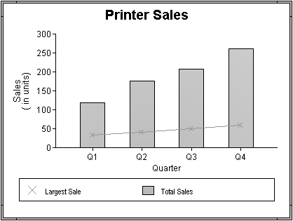
Shown is the Printer Sales graph with line data for the largest sale per quarter overlayed with a bar graph for total printer sales. The legend shows icons an X icon for the largest sale data, and a filled rectangle for the total combined salses of all printers. The filled rectangle has the same color as the bars in the bar overlay. The category axis divides the sales for the printers into four quarters.