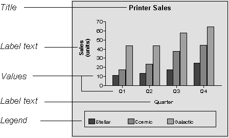
A graph can have four text elements:
Title
Labels for the axes
Text that shows the values along the axes
Legend
Figure 24-20: Text elements of a graph

You can specify properties for each text element.
![]() To specify text properties for the title, labels,
axis values, and legend of a graph:
To specify text properties for the title, labels,
axis values, and legend of a graph:
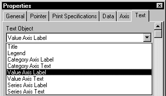
Select Properties from the graph's pop-up menu and then select the Text page in the Properties view.
Select a text element from the list in the Text Object drop-down list.
Figure 24-21: Selecting text elements to change their properties

Specify the font and its characteristics.
With Auto Size in effect, PocketBuilder resizes the text appropriately whenever the graph is resized. With Auto Size disabled, you specify the font size of a text element explicitly.
![]() To have PocketBuilder automatically size a text
element in a graph:
To have PocketBuilder automatically size a text
element in a graph:
On the Text properties page for the graph, select a text element from the list in the Text Object drop-down list.
Select the Autosize check box (this is the default).
![]() To specify a font size for a text element in a
graph:
To specify a font size for a text element in a
graph:
On the Text properties page for the graph, select a text element from the list in the Text Object drop-down list.
Clear the Autosize check box.
Select the Font size in the Size drop-down list.
For all the text elements, you can specify the number of degrees by which you want to rotate the text.
![]() To specify rotation for a text element in a graph:
To specify rotation for a text element in a graph:
On the Text properties page for the graph, select a text element from the list in the Text Object drop-down list.
Specify the rotation you want in the Escapement box, using tenths of a degree (450 means 45 degrees)
Changes you make here are shown in the model graph in the Design view and in the Preview view.
Display formats are masks in which certain characters have special significance that aid in the presentation of information to the user. For more information about defining display formats, see Chapter 21, “Displaying and Validating Data.”
![]() To use a display format for a text element in
a graph:
To use a display format for a text element in
a graph:
On the Text properties page for the graph, select a text element from the list in the Text Object drop-down list.
Type a display format in the Format box or choose one from the pop-up menu.
To display the pop-up menu, click the button to the right of the Format box.
You can specify an expression for the text that is used for each graph element. The expression is evaluated at execution time.
![]() To specify an expression for a text element in
a graph:
To specify an expression for a text element in
a graph:
On the Text properties page for the graph, select a text element from the list in the Text Object drop-down list.
Click the button next to the Display Expression box.
The Modify Expression dialog box displays.
Specify the expression.
You can paste functions, column names, and operators. Included with column names in the Columns box are statistics about the columns, such as counts and sums.
Click OK to return to the graph's Properties view.
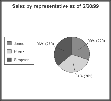
By default, when you generate a pie graph, PocketBuilder puts the title at the top and labels each slice of the pie with the percentage that slice represents of the whole. Percentages are accurate to two decimal places.
Figure 24-22 has been enhanced as follows:
The current date displays in the title
The percentages are rounded to integers
The raw data for each slice is shown in addition to the percentages
Figure 24-22: Pie chart with display enhancements

To enhance the pie chart, the display expressions were modified for the title and pie graph labels as follows:
Element |
Original expression |
Modified expression |
|---|---|---|
Title |
|
|
Pie graph labels |
|
|