![]()
![]()
![]()
![]()
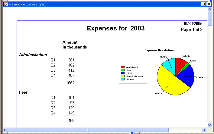
Graphs present data in a visual way so that you can interpret it more easily. You can use graphs to supplement the numbers in a report or you can replace numbers with a graph. InfoMaker provides a variety of graph styles and options.
The graph you create in this tutorial uses financial data (the same data as the Query tutorial). You start with a report that is already created and add a graph to the report. When you have finished, the report and the graph look like this: