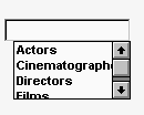
DropDownListBoxes combine the features of a SingleLineEdit and a ListBox.

There are two types of DropDownListBoxes:
Noneditable
Editable
If you want your user to choose only from a fixed set of choices, make the DropDownListBox noneditable.
In these boxes, the only valid values are those in the list.
There are several ways for users to pick an item from a noneditable DropDownListBox:
Use the arrow keys to scroll through the list.
Type a character. The ListBox scrolls to the first entry in the list that begins with the typed character. Typing the character again scrolls to the next entry that begins with the character, unless the character can be combined with the first to match an entry.
Click the down arrow to the right of the edit control to display the list, then select the one you want.
If you want to give users the option of specifying a value that is not in the list, make the DropDownListBox editable by selecting the AllowEdit check box on the General tab page.
With editable DropDownListBoxes, you can choose to have the list always display or not. For the latter type, the user can display the list by clicking the down arrow.
You specify the list in a DropDownListBox the same way as for a ListBox. For information, see “ListBox”.
To indicate the size of the box that drops down, size the control in the Window painter using the mouse. When the control is selected in the painter, the full size—including the drop-down box—is shown.
As with ListBoxes, you can specify whether the list is sorted and whether the edit control is scrollable.
For more information, right-click in any tab page in the Properties view and select Help from the pop-up menu.