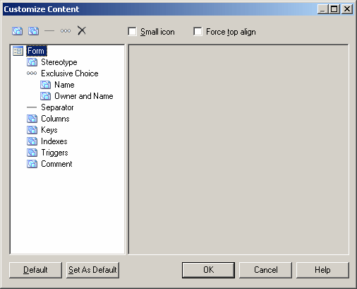
If an object supports customizing the information that you can display on its symbol, an Advanced button is available in the bottom-right corner of its Content Display Preferences page. Click this button to go to the Customize Content window, which allows you to choose and reorder the information that is available for display in the Content window.

The list in the left hand pane shows the properties that are currently available to display on the symbol in the Display Preferences dialog. In the case of link symbols the list contains three sublists, Source, Center, and Destination, which allow you to specify different content to display on each of these parts of the link symbol.
You can drag and drop items to reorder the list, and use the following tools to modify it:
|
Tool |
Description |
|---|---|

|
Add Attributes – allows you to select additional attributes to add to the list. |

|
Add Collections – allows you to select additional collections (such as table columns, class operations, etc) to add to the list. |

|
Add Separator Line – inserts a separator line after the item selected in the list. |

|
Add Exclusive Choice - inserts an item under which you can group properties from which your users will choose one to display. |

|
Delete – removes the selected item from the list. |
The following options control the overall look of symbols:
|
Tool |
Description |
|---|---|
| Small icon |
Places a small object icon in the top-left corner of the symbol in detail mode. |
| Force top align |
Forces top alignment in the symbol for object attributes, such as Name. If this option is not selected, these properties are centered on the vertical axis. |
Configuring Attributes
-
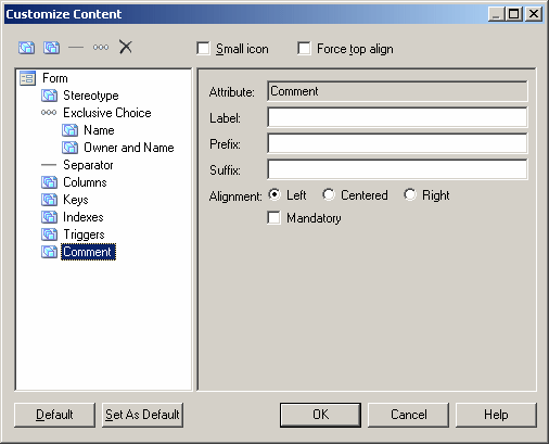
Label - Specify a label to use in the Display Preferences dialog in place of the attribute's name.
-
Prefix and Suffix - Add a prefix and/or suffix to the value of the attribute (text items only).
-
Alignment - Specify the alignment of the text (unlimited text items only).
-
True and False - Specify a value to display for true and false (booleans only) For example, for a boolean attribute, "Annotated", you could specify "Annotated" and "Not Annotated" for true and false. By default, boolean properties are displayed if they are true and do not appear if they are false.
-
Mandatory - Specify that it is mandatory. Mandatory properties are always displayed on the symbol, and are not available for deselection in the Display Preferences dialog.

Configuring Collections
-
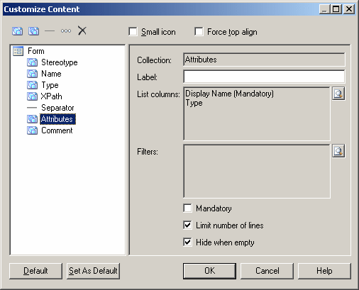
Label - Specify a label to use in the Display Preferences dialog in place of the collection's name.
-
List columns - Specify the properties displayed for each object in the collection. Click the Select tool beside the List columns field to select attributes for display.
-
Filters - Specify one or more filters to offer as options when choosing to display the collection. Click the Select tool beside the Filters columns field to open the Define Available Collection Filters dialog, enter a name for the filter and then click the ellipsis button in the Filter Expression column to define the parameters of the filter. You can specify as many filters as you need. They will be available for selection in the Display Preferences dialog in the form of radio buttons under the checkbox to select the collection
-
Mandatory - Specify that it is mandatory. Mandatory properties are always displayed on the symbol, and are not available for deselection in the Display Preferences dialog.
-
Limit number of lines - Provide a field allowing the user to limit the display of collection members to a number that they enter.
-
Hide when empty - The symbol compartment containing the collection is hidden when there is nothing to display.

Configuring "Exclusive Choices"
-
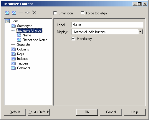
Label - Specify a label to use in the Display Preferences dialog in place of the collection's name.
-
Display - Specify whether the choice displays as horizontal or vertical radio buttons or as a combo list.
-
Mandatory - Specify that it is mandatory. Mandatory properties are always displayed on the symbol, and are not available for deselection in the Display Preferences dialog.
