Chapter 2: Customizing PocketBuilder
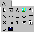
To reduce the size of toolbars, some toolbar buttons have a down arrow on the right that you can click to display a drop-down toolbar containing related buttons.
For example, the down arrow next to the Text button in the DataWindow painter displays the Controls drop-down toolbar, which has a button for each control you can place on a DataWindow object.
Figure 2-4: Buttons in the Controls drop-down toolbar
