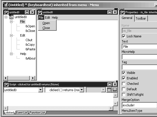
The Menu painter has several views where you specify menu items and how they look and behave. For general information about views, how you use them, and how they are related, see “Views in painters that edit objects”.
The default Menu painter layout shows the Tree Menu view in the top left and the WYSIWYG Menu view in the top middle. The WYSIWYG Menu view displays how the menu will look on the desktop, not on the Windows CE device or emulator.
Figure 13-1: Default Menu painter layout

The Tree Menu and WYSIWYG Menu views are where you specify menu items that display in the menu bar and under items in the menu bar.
This view |
Displays |
|---|---|
Tree Menu |
All the menu items at the same time when the tree is fully expanded. To fully expand the tree or collapse the expanded tree, press Ctrl+Shift+*. |
WYSIWYG Menu |
The menu as it would appear in a desktop application, with the exception of menu items that do not display at runtime if you set their Visible property to false. In the WYSIWYG Menu view, these items diplay in a dithered mode. In applications that you deploy to the Windows CE device or emulator, menu items appear at the bottom of the window, not at the top as in the WYSIWYG view. |
You can use either the Tree Menu view or the WYSIWYG Menu view to insert new menu items on the menu bar or on drop-down (cascading) menus, or to modify existing menu items. The menus in both views change when you make a change in either view.