A PictureListBox, like a ListBox, displays available choices in both text and images. You can specify that PictureListBoxes have scroll bars if more choices exist than can be displayed in the PictureListBox at one time.
You can choose from a group of stock images provided by PowerBuilder, or use any bitmap (BMP) file, icon (ICO) file, GIF file, or JPEG file when you add images to a PictureListBox.
Keep in mind, however, that the images should add meaning to the list of choices. If you use a large number of images in a list, they become meaningless.
You could, for example, use images in a long list of employees to show the department to which each employee belongs, so you might have a list with 20 or 30 employees, each associated with one of five images.
 To add an image to a PictureListBox:
Select the PictureListBox control to display its properties in the Properties view, and then select the Pictures tab.
The Pictures property page displays.
Use the PictureName drop-down ListBox to select stock pictures to add to the PictureListBox
or
Use the Browse button to select a bitmap (BMP) file, icon (ICO) file, GIF file, or JPEG file to include in the PictureListBox.
Specify a picture mask color (the color that will be transparent for the picture).
Specify the height and width for the image in pixels or accept the defaults.
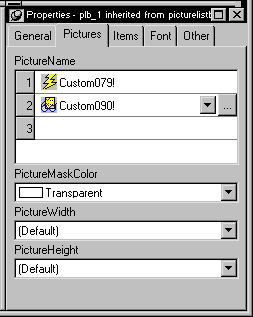
Repeat the procedure for the number of images you plan to use in your PictureListBox.
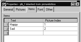
Select the Items tab and change the Picture Index for each item to the appropriate number.
Click OK.
On the Items tab page, you can work with rows in this way:
To |
Do this |
|---|---|
Select a row |
Click the row button on the left, or with the cursor in the edit box, press Shift+Space |
Delete a row |
Select the row and press Delete |
Move a row |
Click the row button and drag the row where you want it or press Shift+Space to select the row and then press Ctrl+Up Arrow or Ctrl+Down Arrow to move the row |
Delete text |
Click the text and select Delete from the pop-up menu |
On the Pictures tab page, you can work with rows in the same way, and also:
To |
Do this |
|---|---|
Browse for a picture |
Select the row and click the Browse button or press F2 |
For information about other properties, right-click in any tab page in the Properties view and select Help from the pop-up menu.
