CheckBoxes are square boxes used to set independent options. When they are selected, they contain a check mark; when they are not selected, they are empty.
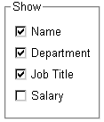
CheckBoxes are independent of each other. You can group them in a GroupBox or rectangle to make the window easier to understand and use, but that does not affect the CheckBoxes' behavior; they are still independent.
CheckBoxes usually have two states: on and off. But sometimes you need to represent a third state, such as Unknown. The third state displays as a grayed box with a check mark.
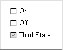
 To enable the third state:
Select the ThreeState property in the General page of the CheckBox Properties view.
To specify that a CheckBox’s current
state is the third state:
Select the ThreeState and the ThirdState properties in the General page of the CheckBox Properties view.
